Mobile Web Case with SharePoint2010
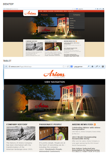
Case SharePoint 2010 Ariensco This is a SharePoint 2010 site that is built to be responsive. For desktop is fine, when you shrink the site to the tablet mode the site is responsive but the navigation disappears and instead you only have "View Navigation." From the user experience point of view, the navigation should be at reach without the user having to click on it, or at least with a JavaScript or custom CSS that when hover up the navigation bar appears. For tablet it is a good design that it is not optimized with the user experience in mind. For tablet the design would have been optimized if the huge picture have been shrank in order to show off their navigation. When we go to mobile is even worst (you only can fully realize that when looking it from your smartphone). Mobile sites should not be picture heavy; otherwise it makes the site for a tiny screen too crowded, difficult to find our way around and battery drained. For Ariensco example of mobile ver...