Posts

Showing posts with the label web apps

Why UX is neglected and its consequences for your business!

This article was the result a response to an article I have published in a LinkedIn group I belong Linked In Front End Developers group User Experience is the heart for any product or service because without a customer to purchase the product or service nobody will manufacture or build a product or service in the first place. This is a fact but it does not mean that clean code and security is less important.  E-commerce example from a security perspective Let's imagine that a customer have an e-commerce site that is the most easy to use and to make customers purchase a breeze, and it has the best conversion rate possible, but it has a terrible security and the site constantly breaks?  How long do you think the e-commerce owner is going to keep in business that way if his customers do not trust to use his wonderful easy to use e-commerce? Not for long however in this case the reason is clear - everybody knows that the problem is in the security and that the code...

Do you want to know what happens when User Experience is not taken into account?

Image
Here is a youtube video where Ozzy literally fights with the custom tv-house control remote while the developers think it is the easiest product ever. Here you can see how important to pay attention to UX before build any software or physical product.

The Myth of HTML5 and How It's Misunderstood

HTML5 MISCONCEPTION Nowadays any new browser capability or web application technique found across the web is labeled as HTML5 and that is not true. Michael Mahemoff said that HTML5 has become a brand that represents a new type of web application rather than the specification itself. In order to learn HTML5 is very important to understand what really HTML5 is. It is common nowadays hear CSS transitions, web sockets, geolocation, SVG, CSS @font-face all mentioned under the HTML5 banner and label all under HTML5 "brand".  In the specification none of those mentioned are found for the simple reason that they either belong to the CSS3 specification or other API specification within the WWW Consortium. Websites are and will be built with a combination of HTML5, next-generation APIs, JavaScript and CSS3, which means that as a designer or developer the difference between those technologies must be clear and how they fit together should be understood. What is really HTML5? ...

Lessons To Be Learned From Facebook Mobile User Growth To 54% From Last Year

Lessons To Be Learned From Facebook Mobile User Growth To 54% From Last Year Today one of the headlines in the -> Online Media Daily was that advertisement on Facebook social network's mobile business rose to 30% of its sales this year compared to almost nothing last year which was responsible for the 39% overall raise of Facebook revenues . The lesson to be learned here is clear MOBILE USE is rising significantly and Facebook knows that because their monthly active mobile users is 751 million in the end of March. What that means? It means that Facebook mobile monthly active users have grew 54% from last year. Let's compare a bit The numbers above show how mobile users has double this year compared to the last one, but the same Facebook has announced that their monthly active users grew 23% compared to last year. This is  a real bomb news for the Mobile World It means that mobile is growing so fast that any company that try to blind itself...

GREAT FREE WEBSITE EMULATORS FOR TESTING HOW YOUR SITE LOOKS IN THE MOBILE

Image
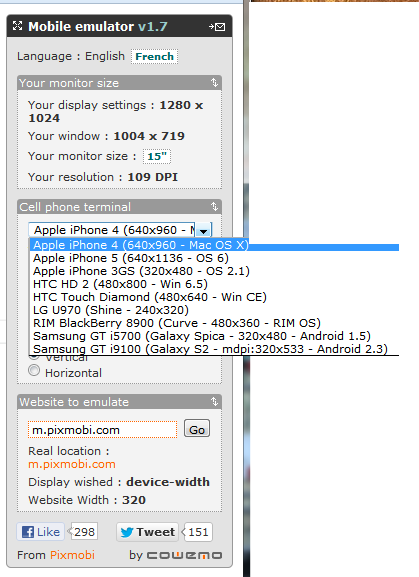
GREAT FREE WEBSITE EMULATORS FOR TESTING HOW YOUR SITE LOOKS IN THE MOBILE The single most important thing you can do to make a website mobile-friendly is to test it on multiple smartphone and tablet platforms. Mobile Emulators lets you check how responsive and if all the functionalities it should have works well across different mobile platforms such as iPhone, iPad, Android and Blacberry without have to make the investment in all those devices. Mobile emulators are not perfect but they can help you to check the issues your website might have allowing you to take the corrective measures. Here are some great websites with emulators: 1. iPad Peek   ( http://ipadpeek.com/ ) - let you check if your website is compatible with iPad. 2. iPhone Tester ( http://iphonetester.com/ ) - A popular choice of web emulator for iPhone. Just enter the URL of your website and in real-time you can see how your site looks like on iPhone. 3. Mobile Phone Emulator ( http://www.mobilephone...
Image
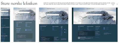
THE REALITY OF RESPONSIVE DESIGN TO THE MOBILE SCREEN (The mobile analysis was done based on the sites presented on  mediaqueri.es .) Here you can see how responsive design are great for some desktop and tablets but might be a bad choice to communicate what your business is and what the user can do in the tine mobile screen. Check for yourself snl.no the big picture with the search in my Nokia Lumia gets the whole screen just for search, to see the rest, what the site is about and what it offers me as a user I have to scroll down. It could be better design for mobile, but this is a good responsive design for desktop and tablets. Another one is Suffandnonsense.co.uk the image when you open is the whole screen, to see what the site is about I have to scroll down. It could be better done for mobile but it is very good for desktop and tablets. You can check for yourself on your mobile all of the sites - this is good exercise to see that pictures might speak m...

RETHINKING THE MOBILE WEB presentation by Bryan Rieger

This is a Slideshow RETHINKING THE MOBILE WEB by by Yiibu Author: Bryan Rieger (September 10, 2010)

WHY AREN’T MOBILE WEB DEVELOPERS DOING THEIR JOB?

I came across a very interesting website quirksmode.org in the Mobile section that explain beatifully in many parts what I believe that is the problem with mobile web design nowadays. I will be copying what I think is the most important points here. Some I might discuss but you will understand the probem when you read it. MOBILE WEB DEVELOPERS DOING THEIR JOB? The unique selling point of the web is that it runs on all devices; and not just on one platform. But it seems mobile web developers aren’t much interested in reaching out beyond one or two specific platforms. Developers should reach out to as many paltforms as humanly possible instead of confining themselves to the best ones. WHY ARE WEB DEVELOPERS INTERESTED IN MOBILE SO RELUCTANT TO VENTURE OUT BEYOUND THEIR iPHONE CONFORT ZONE? Mobile web projects for large companies are based on requirements written last year, during the height of the iPhone obsession. In addition, the iPhone’s share of mobile web traffic remains...

RESPONSIVE DESIGN TEMPLATE FRAMEWORKS. ARE THEY ANY GOOD?

Image
Yes, responsive design frameworks are a good thing but it all depends on your website. Remember there is no one solution for all and if you can use a framework to make a responsive design for all it will depend if you have a content base site and if your site is not "user-specific interaction dependent". I have watched the Sitefinity webinar (embbedded below) and the tool is very useful for creating Responsive Design and even mobile that is content base such as magazines, newspapers and any other website that does not require the user to do a specifc thing on the site. The added bonus on the tool is that the user edit blocks of layout template that is not table based and their text clean out any style done by text processors - this is a tool build with the user experience in mind. However as Sitefinity presenter said himself at the end of the webinar "Responsive Design is not a complete solution..., there is still a lot of granulatity..." You can hear ...

MOBILE WEB APP APPROACHES

In my earlier post about the differences between Responsive Design and Mobile Web App I have talked about two of the three approaches for mobile web app: The second that is Responsive Design and the third that is Mobile-Specific , but what about the first? Here is the first approach that is not recommended but depending on the website, its design, its content and its purpose, it might be ok. 1. "Do nothing" approach This approach is the one which desktop content is served to the mobile device unaltered. This is unfortunately the most used approach for mobile around the world, however it is changing fast. The good side of this approach is that it is less work to do and no need to maintain, however it is not an optimal choice regarding user experience and nurturing your customers. This approach is good for lightweight pages that have flexible content and that is arrange in such a way that it is not totally zoomed out and is easy to read when tabbing twice the text. ...
Native Apps vs. Mobile Web: Breaking Down the Mobile Ecosystem Web Apps vs. Native Apps, a topic that still excites readers to this day, as if it were anticipated that one side will win and the other will lose. Contrary to popular belief, the discussion doesn’t need to produce a winner and a loser. Instead of classifying apps as web apps or as native apps, why not just call them mobile apps?  I believe “mobile app” is a great name. Under this name there are simply two variations of mobile app that can be created: web app and native app. A web app is an HTML5, JavaScript, CSS app running in a mobile browser. Now, you might wonder, why not just call this a mobile site? This is a fair point, and I believe the term, “mobile site,” can also be used. However, it is common to distinguish a mobile web app by one important extra feature, that it is invoking some remote services, usually a REST API (instead of just loading a static mobile website). The second variation is th...