Posts

Showing posts with the label mobile web

What UX is and why your company cannot live without it?

Most of IT companies don’t see UX (User Experience) should be at the heart of everything they do which leads to their inability to present and sell UX as the starting point of any project. UX in most case is sold as an “extra” service while they should be seen as the starting point of any IT business strategy. UX is everything - it starts with the customers, go deeper to their customers and it should end with them in mind! What UX really is? UX is a business and digital field in itself. The misconception here is that most people think of UX as just usability. Usability though is simply how easy to use and simple the website functionalities are to the end user. For usability we have plenty of best practices already in place and even standardized. Bear  in mind that usability is only part of UX! UX is a continuous work that starts by what customers want to accomplish with their site, and not how they want the site to be , unless they are the ultimate end user of the site...
Lessons To Be Learned From Facebook Mobile User Growth To 54% From Last Year

Lessons To Be Learned From Facebook Mobile User Growth To 54% From Last Year Today one of the headlines in the -> Online Media Daily was that advertisement on Facebook social network's mobile business rose to 30% of its sales this year compared to almost nothing last year which was responsible for the 39% overall raise of Facebook revenues . The lesson to be learned here is clear MOBILE USE is rising significantly and Facebook knows that because their monthly active mobile users is 751 million in the end of March. What that means? It means that Facebook mobile monthly active users have grew 54% from last year. Let's compare a bit The numbers above show how mobile users has double this year compared to the last one, but the same Facebook has announced that their monthly active users grew 23% compared to last year. This is  a real bomb news for the Mobile World It means that mobile is growing so fast that any company that try to blind itself...

REAL USABILITY MATTERS

REAL USABILITY MATTERS - Usability is one of the single most important thing you can do to ensure success and money. Any design should have the user in mind, however when we talk about small screens this is a must. The Google presentations  What is a mobile site and why do you need one?  try to give business people and even developers the awareness that mobile sites nowadays is a must - but if they are build without the user in mind there is not use to have it. Their case studies are interesting. Mobile-friendly web apps help businesses: To connect with their customers Increase Revenues Reduce Costs because when sites are optimised and user-friendly you give your customers means to get what they want instead of wonder around, get tired and go to your competitor. The catch is that the only way to accomplish that is to invest in Usability. IT IS ALL ABOUT USABILITY. Improved usability makes you INCREASE YOUR MARKET SHARE - the like effect...

Mobile Friendly Contact Forms

Mobile Friendly Contact Forms The way to go for mobile friendly contact forms is the touch-friendly CSS styling in order to make the buttons, controls and inputs with touchscreen experience. 1. Large touch target areas will definitely improve the form input fields 2. Other forms of input can also greatly benefit from input controls with CSS styling 3. HTML5 input types should be use to trigger keyboard events to aid the user on having  a great experience. Depending on the input type selected mobile browsers have different on-screen keyboards for different froms of data that should be taken into account. Just by including in the label the type="" and inside the quotes tel for phone numbers, url for websites, time for time, date for the date, e-mail for email we can make the keyboard behave accordingly with is very useful. I constantly came across mobile websites that make me look for the @ when I have to enter my e-mail, or any other type of data that is n...

Mobile Web Case with SharePoint2010

Image
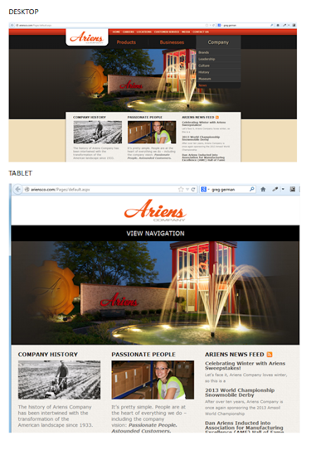
Case SharePoint 2010   Ariensco This is a SharePoint 2010 site that is built to be responsive. For desktop is fine, when you shrink the site to the tablet mode the site is responsive but the navigation disappears and instead you only have "View Navigation." From the user experience point of view, the navigation should be at reach without the user having to click on it, or at least with a JavaScript or custom CSS that when hover up the navigation bar appears.  For tablet it is a good design that it is not optimized with the user experience in mind. For tablet the design would have been optimized if the huge picture have been shrank in order to show off their navigation. When we go to mobile is even worst (you only can fully realize that when looking it from your smartphone). Mobile sites should not be picture heavy; otherwise it makes the site for a tiny screen too crowded, difficult to find our way around and battery drained.  For Ariensco example of mobile ver...

RETHINKING THE MOBILE WEB presentation by Bryan Rieger

This is a Slideshow RETHINKING THE MOBILE WEB by by Yiibu Author: Bryan Rieger (September 10, 2010)

WHY AREN’T MOBILE WEB DEVELOPERS DOING THEIR JOB?

I came across a very interesting website quirksmode.org in the Mobile section that explain beatifully in many parts what I believe that is the problem with mobile web design nowadays. I will be copying what I think is the most important points here. Some I might discuss but you will understand the probem when you read it. MOBILE WEB DEVELOPERS DOING THEIR JOB? The unique selling point of the web is that it runs on all devices; and not just on one platform. But it seems mobile web developers aren’t much interested in reaching out beyond one or two specific platforms. Developers should reach out to as many paltforms as humanly possible instead of confining themselves to the best ones. WHY ARE WEB DEVELOPERS INTERESTED IN MOBILE SO RELUCTANT TO VENTURE OUT BEYOUND THEIR iPHONE CONFORT ZONE? Mobile web projects for large companies are based on requirements written last year, during the height of the iPhone obsession. In addition, the iPhone’s share of mobile web traffic remains...

MOBILE WEB APP APPROACHES

In my earlier post about the differences between Responsive Design and Mobile Web App I have talked about two of the three approaches for mobile web app: The second that is Responsive Design and the third that is Mobile-Specific , but what about the first? Here is the first approach that is not recommended but depending on the website, its design, its content and its purpose, it might be ok. 1. "Do nothing" approach This approach is the one which desktop content is served to the mobile device unaltered. This is unfortunately the most used approach for mobile around the world, however it is changing fast. The good side of this approach is that it is less work to do and no need to maintain, however it is not an optimal choice regarding user experience and nurturing your customers. This approach is good for lightweight pages that have flexible content and that is arrange in such a way that it is not totally zoomed out and is easy to read when tabbing twice the text. ...

Mobile Web Development Strategies also to your mobile

Image
This blog is also available on mobile form, which means that you can read and comment from your phone as well. What would be a blog that speaks about mobile web development that is not available on mobile?

CREATING CONTENT FOR MULTIPLE FORM FACTORS

One of the critical parts of creating applications for devices is taking into the form factor (Form Factor means the sizes of the devices among other electronic things). This includes the size of the screen or the resolution of the device. HOW WILL THE APPLICATION LOOK ON PHONES versus TABLETS? 1. There are many applications that are built specifically for phones or specifically for tablets, but there are some inherent web technologies that can be used to target both with mobile web applications. 2. One of the most common tactics for creating content that works across devices is with responsive design. 3. Many web developers use responsive design as Responsive design lets you specify different CSS files for different screen size with media queries. So instead of creating entirely new content or an entirely new application for smartphones or tablets, CAN WE REUSE CONTENT AND SIMPLY SWAP OUR NEW CSS RULES DEPENDING ON THE SIZE OF THE SCREEN? Yes and it is the easies...

MOBILE WEB APP BENEFITS

There are many different ways to deploy content to devices for developers. The main distinctions between content that runs inside the device’s web browser, just like any website, and the content that runs as an application on the device. Mobile applications give you a lot of benefits. MOBILE WEB APP 1. Give access to device features and sensors that are not normally available to websites. These are things like camera, offline, storage, and information on the device like what is in the phone’s contact list. 2. All the major platforms tend to have very different ways to build mobile applications. They each require their own tools and languages to deploy applications and create content form them. A good example is Xcode and Objective-C for building iOS applications, and Eclipse and Java for building Android applications.

Mobile Web Application x Native Application Has anyone experience with one or the other? What was your experience or dealing with mobile Web from a customer point of view?

Which to choose Mobile Web app or Native app? Before to know what to do is important to know the difference between the two. Web App is accessed on the Web viea the user's browser, but it is an website that offers app-like functionalities. Native App is platform driven, in other words, it is built for example for Andoid or iOS, or Windows 8 devices. It has to be installed on the user device just like an application that we install in our desktop. Native Apps offer superior experience but the cons is that it is not suitable for everykind of company and to write one code that works in everything is not that simple.