Posts

Showing posts with the label multiple devices

User-Centered - Mobile First - Responsive Design

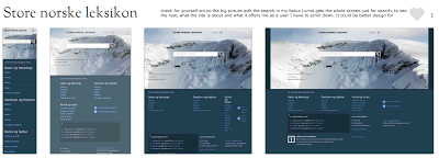
Today I am sharing a slideshare presentation of the Norwegian designer Ida Aalen because many of the topics she speaks on her presentation I have already been talking of the last months on other articles of this same blog. Topics such as: 1. User-centered design and that whoever shout the most win and it is often the user. 2. Mobile first and that design for mobile should come first. (See earlier articles on this subject in this same blog). I specially like her analogy when she mention the book Mobile First by Luke Wroblewski " If it's not important enough to put on mobile, is it important to put on the desktop?" 3. Responsive Design and that browser landscape becomes bigger and smaller at the same time with same content on all platforms and the need for adaptative presentation that are future-friendly. From the book on Responsive Design by Ethan Marcotte. I highly recommend Ida's presentation and to make it easy to see I am making it very user-friendly and embe...

What UX is and why your company cannot live without it?

Most of IT companies don’t see UX (User Experience) should be at the heart of everything they do which leads to their inability to present and sell UX as the starting point of any project. UX in most case is sold as an “extra” service while they should be seen as the starting point of any IT business strategy. UX is everything - it starts with the customers, go deeper to their customers and it should end with them in mind! What UX really is? UX is a business and digital field in itself. The misconception here is that most people think of UX as just usability. Usability though is simply how easy to use and simple the website functionalities are to the end user. For usability we have plenty of best practices already in place and even standardized. Bear  in mind that usability is only part of UX! UX is a continuous work that starts by what customers want to accomplish with their site, and not how they want the site to be , unless they are the ultimate end user of the site...

Do you know what is XAMARIN?

Do you know what is XAMARIN? If work with C# and design/build for mobile web and apps this is the tools for you. Much like PhoneGap, XAMARIN is a cross paltform tool for developers who works with C#. They also have a XAMARIN studio (like Aptana and Titanium Studio) and will make your life a lot easier. It also come with a limited free edition that can be used. Check it out...  xamarin.com
Image
THE REALITY OF RESPONSIVE DESIGN TO THE MOBILE SCREEN (The mobile analysis was done based on the sites presented on  mediaqueri.es .) Here you can see how responsive design are great for some desktop and tablets but might be a bad choice to communicate what your business is and what the user can do in the tine mobile screen. Check for yourself snl.no the big picture with the search in my Nokia Lumia gets the whole screen just for search, to see the rest, what the site is about and what it offers me as a user I have to scroll down. It could be better design for mobile, but this is a good responsive design for desktop and tablets. Another one is Suffandnonsense.co.uk the image when you open is the whole screen, to see what the site is about I have to scroll down. It could be better done for mobile but it is very good for desktop and tablets. You can check for yourself on your mobile all of the sites - this is good exercise to see that pictures might speak m...

WHY AREN’T MOBILE WEB DEVELOPERS DOING THEIR JOB?

I came across a very interesting website quirksmode.org in the Mobile section that explain beatifully in many parts what I believe that is the problem with mobile web design nowadays. I will be copying what I think is the most important points here. Some I might discuss but you will understand the probem when you read it. MOBILE WEB DEVELOPERS DOING THEIR JOB? The unique selling point of the web is that it runs on all devices; and not just on one platform. But it seems mobile web developers aren’t much interested in reaching out beyond one or two specific platforms. Developers should reach out to as many paltforms as humanly possible instead of confining themselves to the best ones. WHY ARE WEB DEVELOPERS INTERESTED IN MOBILE SO RELUCTANT TO VENTURE OUT BEYOUND THEIR iPHONE CONFORT ZONE? Mobile web projects for large companies are based on requirements written last year, during the height of the iPhone obsession. In addition, the iPhone’s share of mobile web traffic remains...

CREATING CONTENT FOR MULTIPLE FORM FACTORS

One of the critical parts of creating applications for devices is taking into the form factor (Form Factor means the sizes of the devices among other electronic things). This includes the size of the screen or the resolution of the device. HOW WILL THE APPLICATION LOOK ON PHONES versus TABLETS? 1. There are many applications that are built specifically for phones or specifically for tablets, but there are some inherent web technologies that can be used to target both with mobile web applications. 2. One of the most common tactics for creating content that works across devices is with responsive design. 3. Many web developers use responsive design as Responsive design lets you specify different CSS files for different screen size with media queries. So instead of creating entirely new content or an entirely new application for smartphones or tablets, CAN WE REUSE CONTENT AND SIMPLY SWAP OUR NEW CSS RULES DEPENDING ON THE SIZE OF THE SCREEN? Yes and it is the easies...