Posts

Showing posts with the label Mobile

Mobile First by Adobe, LinkedIn, IBM and LukeW

Image
With the boom of mobile that has surpassed the number of PC at a 1000 times, mobile first is a need that unfortunately still many companies don't get it. Here an OLD, keynote from Adobe Max 2010 where,  Adobe CTO Kevin Lynch made the case for designing Web products for mobile first: Another one from Eric Schmidt about Mobile First: Mobile First at FACEBOOK! How to design component for mobile first by LukeW: Mobile First by LinkedIN talks with LukeW: IBM -> Mobile First: Intel Software Interview - "Mobile First" - Luke Wroblewski wrote the Book Just to complete the MOBILE FIRST thought, just get a look on Luke Wroblewski slide on the statistics about the use PCs and the use of MOBILE: Just pay attention in the graphic that in 2011 PCs and Mobile had the same amount and from that point on, it sky rocket at the point that there is no deny that if companies don't start to pay attention about mobile first they will be fade to a sl...

User Center Approach for Mobile

Image
I have been pitching about how mobile mindset and user experience is important for any digital marketing and branding already for some time in earlier posts. Here are some questions you can actually ask yourself before start your digital business plan: 1. Who is/are our target user(s) for each of the segment(s) we work on and the features we need to deliver to them in order to secure the customers we have and accquire much more customers? 2. What is/are the problem(s) we are trying to solve for the segement(s) we are working on? 3. What are the business needes we are tying to fulfill? 3. How can we measure while the project is ongoing? Are we are doing the right things? and not only when the project is done. 4. How to constant measure the new features implemented in order to know when something is working or not? Once the critical points for the digital strategy are in place we should be able to answer the following questions: 1. The problem we are trying to solve is ..... 2...

RESPONSIVE MAN

Image
I came across today a website that explain with responsive man face what I have been pitching about responsive design since the beginning of this blog. I took screenshots of the flash site just to demonstrate how easy is to understand why responsive design doesn't work for all types of sites. This is how the site look in the desktop size a normal man with his eyes moving. See the desktop big screen in black in the top. As soon as I resize the window at the brake point for the tablet the image distort. You can still recognise a man's face, however it is clearly  distorted. See the tablet indicator in the top of the page. Continuing resizing the window to the break point of a mini-tablet, I get the same image of the tablet, in a minimal proportion. See the space above the head, it wasn't there when the window size was a little bigger. Now is when the black magic happens. When it comes to the size of the smartphone, we do not have a man a...

User-Centered - Mobile First - Responsive Design

Today I am sharing a slideshare presentation of the Norwegian designer Ida Aalen because many of the topics she speaks on her presentation I have already been talking of the last months on other articles of this same blog. Topics such as: 1. User-centered design and that whoever shout the most win and it is often the user. 2. Mobile first and that design for mobile should come first. (See earlier articles on this subject in this same blog). I specially like her analogy when she mention the book Mobile First by Luke Wroblewski " If it's not important enough to put on mobile, is it important to put on the desktop?" 3. Responsive Design and that browser landscape becomes bigger and smaller at the same time with same content on all platforms and the need for adaptative presentation that are future-friendly. From the book on Responsive Design by Ethan Marcotte. I highly recommend Ida's presentation and to make it easy to see I am making it very user-friendly and embe...

What UX is and why your company cannot live without it?

Most of IT companies don’t see UX (User Experience) should be at the heart of everything they do which leads to their inability to present and sell UX as the starting point of any project. UX in most case is sold as an “extra” service while they should be seen as the starting point of any IT business strategy. UX is everything - it starts with the customers, go deeper to their customers and it should end with them in mind! What UX really is? UX is a business and digital field in itself. The misconception here is that most people think of UX as just usability. Usability though is simply how easy to use and simple the website functionalities are to the end user. For usability we have plenty of best practices already in place and even standardized. Bear  in mind that usability is only part of UX! UX is a continuous work that starts by what customers want to accomplish with their site, and not how they want the site to be , unless they are the ultimate end user of the site...

REAL USABILITY MATTERS

REAL USABILITY MATTERS - Usability is one of the single most important thing you can do to ensure success and money. Any design should have the user in mind, however when we talk about small screens this is a must. The Google presentations  What is a mobile site and why do you need one?  try to give business people and even developers the awareness that mobile sites nowadays is a must - but if they are build without the user in mind there is not use to have it. Their case studies are interesting. Mobile-friendly web apps help businesses: To connect with their customers Increase Revenues Reduce Costs because when sites are optimised and user-friendly you give your customers means to get what they want instead of wonder around, get tired and go to your competitor. The catch is that the only way to accomplish that is to invest in Usability. IT IS ALL ABOUT USABILITY. Improved usability makes you INCREASE YOUR MARKET SHARE - the like effect...

Mobile Friendly Contact Forms

Mobile Friendly Contact Forms The way to go for mobile friendly contact forms is the touch-friendly CSS styling in order to make the buttons, controls and inputs with touchscreen experience. 1. Large touch target areas will definitely improve the form input fields 2. Other forms of input can also greatly benefit from input controls with CSS styling 3. HTML5 input types should be use to trigger keyboard events to aid the user on having  a great experience. Depending on the input type selected mobile browsers have different on-screen keyboards for different froms of data that should be taken into account. Just by including in the label the type="" and inside the quotes tel for phone numbers, url for websites, time for time, date for the date, e-mail for email we can make the keyboard behave accordingly with is very useful. I constantly came across mobile websites that make me look for the @ when I have to enter my e-mail, or any other type of data that is n...

Do you know what is XAMARIN?

Do you know what is XAMARIN? If work with C# and design/build for mobile web and apps this is the tools for you. Much like PhoneGap, XAMARIN is a cross paltform tool for developers who works with C#. They also have a XAMARIN studio (like Aptana and Titanium Studio) and will make your life a lot easier. It also come with a limited free edition that can be used. Check it out...  xamarin.com
Image
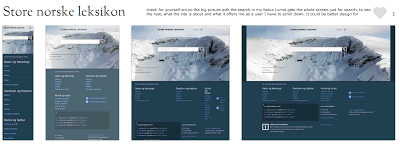
THE REALITY OF RESPONSIVE DESIGN TO THE MOBILE SCREEN (The mobile analysis was done based on the sites presented on  mediaqueri.es .) Here you can see how responsive design are great for some desktop and tablets but might be a bad choice to communicate what your business is and what the user can do in the tine mobile screen. Check for yourself snl.no the big picture with the search in my Nokia Lumia gets the whole screen just for search, to see the rest, what the site is about and what it offers me as a user I have to scroll down. It could be better design for mobile, but this is a good responsive design for desktop and tablets. Another one is Suffandnonsense.co.uk the image when you open is the whole screen, to see what the site is about I have to scroll down. It could be better done for mobile but it is very good for desktop and tablets. You can check for yourself on your mobile all of the sites - this is good exercise to see that pictures might speak m...

RESPONSIVE DESIGN TEMPLATE FRAMEWORKS. ARE THEY ANY GOOD?

Image
Yes, responsive design frameworks are a good thing but it all depends on your website. Remember there is no one solution for all and if you can use a framework to make a responsive design for all it will depend if you have a content base site and if your site is not "user-specific interaction dependent". I have watched the Sitefinity webinar (embbedded below) and the tool is very useful for creating Responsive Design and even mobile that is content base such as magazines, newspapers and any other website that does not require the user to do a specifc thing on the site. The added bonus on the tool is that the user edit blocks of layout template that is not table based and their text clean out any style done by text processors - this is a tool build with the user experience in mind. However as Sitefinity presenter said himself at the end of the webinar "Responsive Design is not a complete solution..., there is still a lot of granulatity..." You can hear ...

Are you born mobile

Image
Are you born mobile I have a group in LinkedIn with the same name of this blog and I got a post from one of the members from Qualcomn with this wonderful video experiment that is funny and will definitely cheer you up at the same time show you how important the mobile is in our live and that good surprises may come out of it too. "We wanted to make everyday life better with mobile, so we brought in a few surprises to a bus stop. We put up a poster featuring a URL. We waited for people to visit the mobile site. When they pressed the button, the fun began. Watch to see what happens when we created the best bus stop ever."

MOBILE WEB APP APPROACHES

In my earlier post about the differences between Responsive Design and Mobile Web App I have talked about two of the three approaches for mobile web app: The second that is Responsive Design and the third that is Mobile-Specific , but what about the first? Here is the first approach that is not recommended but depending on the website, its design, its content and its purpose, it might be ok. 1. "Do nothing" approach This approach is the one which desktop content is served to the mobile device unaltered. This is unfortunately the most used approach for mobile around the world, however it is changing fast. The good side of this approach is that it is less work to do and no need to maintain, however it is not an optimal choice regarding user experience and nurturing your customers. This approach is good for lightweight pages that have flexible content and that is arrange in such a way that it is not totally zoomed out and is easy to read when tabbing twice the text. ...

Mobile Web Development Strategies also to your mobile

Image
This blog is also available on mobile form, which means that you can read and comment from your phone as well. What would be a blog that speaks about mobile web development that is not available on mobile?

There is no which is better between Mobile Web and App - it all depends on the product and service. The next link might clarify better this debate for you.

Why the mobile web vs. apps debate is a false dichotomy The arguments presented in favor of the mobile web over mobile native represent a false dichotomy. Simply put, there is no universal truth in the mobile web vs. mobile native debate, and no “one right way,” despite what the pontificators would have you believe. The argument in favor of mobile web goes like this: The web is open, ubiquitous, requires no special software, is globally searchable and algorithmically discoverable. As such, it is agile, extensible and readily manageable. Plus, there are lots of proven models for development, discovery, distribution and monetization. And, of course, mobile web development offers a higher degree of symmetry to PC browser-based web development than mobile native app development does. The argument is favor of mobile native goes like this: There are over 400 million iOS devices and over 500 million Android devices, representing almost 1 billion devices worldw...
WHAT's IS A MOBILE WEB APP? A mobile web app is a mobile application that combines the versatility of the web with the functionality of touch-enabled devices. Mobile Web Apps should be built with HTML5 and take advantage of the best of this cutting edge technology — providing an attractive alternative to the app stores, while still providing users with the rich look and feel of native applications. Because mobile web apps are web-based, they are compatible with both iPhone and Android smartphones — making it easy to deliver your content to a large mobile audience. Since mobile web apps don't need to be listed in the Apple App Store or Google’s Android Marketplace, you can distribute your mobile web app on your own terms without complex and lengthy approvals. Just quick and easy widespread distribution through multiple channels including: a mobile link (URL), text (SMS), barcodes (QR), social media networks, email, and more. Mobile web apps can include existi...

Why responsive design is not good for Smartphones?

Smartphone is a mobile device in which people does not have time or are in the environment that is suitable to input anything. This means the more you facilitate your customers to do what he or she has to do on your mobile Web site the more they will come for more, stick with your company and even recommend your company for the easy of use even when mobile. What is the user experience you provide for your customers on your mobile Web? If you use responsive design, what do you consider when building the Smarthphone version? Do you ask your customers what they need and what when using the Smartphone or you do what you think is best without considering the users who will be using the site? without considering their environment conditions and what they really would like to use your site for when mobile?

RESPONSIVE DESIGN x MOBILE WEB SITE

RESPONSIVE DESIGN is a way to make the same desktop website change through different CSS stylesheets. The HTML site is nothing more than text wrapped within tags that has no style whatsoever.  When we include some meta tags within the head in the HTML document that limits the range of sizes recognized for tablets and for smartphone applying for both different CSS stylesheet built for specific for tables and for smartphones.  Responsive Design is of the 3 Mobile Web Development strategies that is appropriated for semantic markup that use stylesheets and script to define appearance such as images, layout, etc. It is not appropriated for all websites, products or companies. MOBILE WEB APP or MOBILE-SPECIFC approach is the one which mobile-specific content is built and delivered to mobile devices (both tablets and/or smartphones). This approach is the third of the 3 mobile content approaches and usually involves some kind of server-side detection and redirection. Mobile-specifi...

WHY GO MOBILE?

Go mobile means serve a mobile user who has different needs using mobile devices than the user accessing a Web page from the desktop. According to Cisco: “By the end of 2013, the number of mobile-connected devices will exceed the number of people on earth, and by 2017 there will be nearly 1.4 mobile devices per capita. There will be over 10 billion mobile-connected devices in 2017, including machine-to-machine (M2M) modules-exceeding the world's population at that time (7.6 billion).” http://www.cisco.com/en/US/solutions/collateral/ns341/ns525/ns537/ns705/ns827/white_paper_c11-520862.html Why companies should go mobile? 1. There are already too much mobile devices out there to you ignore its existence; 2. Your competitor already are opening their eyes for the opportunity to server their customers though mobile devices; and 3. Unless you want to lose your customers for lack of mobility - you must go Mobile.