THE REALITY OF RESPONSIVE DESIGN TO THE MOBILE SCREEN
(The mobile analysis was done based on the sites presented on mediaqueri.es.)Here you can see how responsive design are great for some desktop and tablets but might be a bad choice to communicate what your business is and what the user can do in the tine mobile screen.
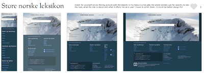
Check for yourself snl.no the big picture with the search in my Nokia Lumia gets the whole screen just for search, to see the rest, what the site is about and what it offers me as a user I have to scroll down. It could be better design for mobile, but this is a good responsive design for desktop and tablets.
Another one is Suffandnonsense.co.uk the image when you open is the whole screen, to see what the site is about I have to scroll down. It could be better done for mobile but it is very good for desktop and tablets.
Here are two that I see on my mobile as good examples of responsive design applicable for mobile that works fine.
The 2013.uxlondon.com tell exactly what the site is about and to learn more I scroll down and see all the speakers photos with a very short relevant info about them.
As you can see there are a lot of factors to consider when building a mobile design and just responsive design is the most appropriated for tablets and mobiles that are content driven.


Comments
Post a Comment