Posts

Showing posts with the label Strategies

The secrets of the Science of Persuasion by Robert Cialdini & Steve Martin

Image
How are we persuaded and how to persuade? It is a mistake to think people consider all the available information when they need to decide if they purchase something. This is an ideal situation that rarely happens. Marketing information is everywhere and nowadays with the digital world in addition to physical we have social and digital marketing overwhelming our lives with millions of choices which makes impossible for a single human being decide considering all the possible situations and available products and services. This means that without some clear marketing rules digital and normal marketers are not going to get far on the art of persuasion. There is a research done by Robert Cialdini & Steve Martin on the Science of Persuasion that reveal 6 universal shortcuts that guide human behavior that is worth knowing from both perspectives: The user – to know how we are manipulated The Digital Business marketer – it can guide our marketing strategies as business people. ...
How user centered design results in significant return on investment (ROI)

Image
User experience is the science and art of designing a product no matter if it's a digital or physical product which it's easy to use. The important thing is that it meet the expectation of the user but at the same time also meet business goals. Here is an animated video Dr. Susan Weinschenk demonstrates how user centered design results in significant return on investment (ROI). Here is the poster of the presentation:

What UX is and why your company cannot live without it?

Most of IT companies don’t see UX (User Experience) should be at the heart of everything they do which leads to their inability to present and sell UX as the starting point of any project. UX in most case is sold as an “extra” service while they should be seen as the starting point of any IT business strategy. UX is everything - it starts with the customers, go deeper to their customers and it should end with them in mind! What UX really is? UX is a business and digital field in itself. The misconception here is that most people think of UX as just usability. Usability though is simply how easy to use and simple the website functionalities are to the end user. For usability we have plenty of best practices already in place and even standardized. Bear  in mind that usability is only part of UX! UX is a continuous work that starts by what customers want to accomplish with their site, and not how they want the site to be , unless they are the ultimate end user of the site...

The Myth of HTML5 and How It's Misunderstood

HTML5 MISCONCEPTION Nowadays any new browser capability or web application technique found across the web is labeled as HTML5 and that is not true. Michael Mahemoff said that HTML5 has become a brand that represents a new type of web application rather than the specification itself. In order to learn HTML5 is very important to understand what really HTML5 is. It is common nowadays hear CSS transitions, web sockets, geolocation, SVG, CSS @font-face all mentioned under the HTML5 banner and label all under HTML5 "brand".  In the specification none of those mentioned are found for the simple reason that they either belong to the CSS3 specification or other API specification within the WWW Consortium. Websites are and will be built with a combination of HTML5, next-generation APIs, JavaScript and CSS3, which means that as a designer or developer the difference between those technologies must be clear and how they fit together should be understood. What is really HTML5? ...

REAL USABILITY MATTERS

REAL USABILITY MATTERS - Usability is one of the single most important thing you can do to ensure success and money. Any design should have the user in mind, however when we talk about small screens this is a must. The Google presentations  What is a mobile site and why do you need one?  try to give business people and even developers the awareness that mobile sites nowadays is a must - but if they are build without the user in mind there is not use to have it. Their case studies are interesting. Mobile-friendly web apps help businesses: To connect with their customers Increase Revenues Reduce Costs because when sites are optimised and user-friendly you give your customers means to get what they want instead of wonder around, get tired and go to your competitor. The catch is that the only way to accomplish that is to invest in Usability. IT IS ALL ABOUT USABILITY. Improved usability makes you INCREASE YOUR MARKET SHARE - the like effect...
Image
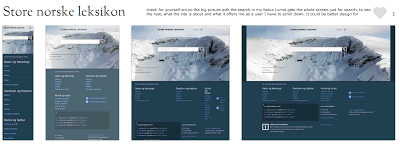
THE REALITY OF RESPONSIVE DESIGN TO THE MOBILE SCREEN (The mobile analysis was done based on the sites presented on  mediaqueri.es .) Here you can see how responsive design are great for some desktop and tablets but might be a bad choice to communicate what your business is and what the user can do in the tine mobile screen. Check for yourself snl.no the big picture with the search in my Nokia Lumia gets the whole screen just for search, to see the rest, what the site is about and what it offers me as a user I have to scroll down. It could be better design for mobile, but this is a good responsive design for desktop and tablets. Another one is Suffandnonsense.co.uk the image when you open is the whole screen, to see what the site is about I have to scroll down. It could be better done for mobile but it is very good for desktop and tablets. You can check for yourself on your mobile all of the sites - this is good exercise to see that pictures might speak m...

RETHINKING THE MOBILE WEB presentation by Bryan Rieger

This is a Slideshow RETHINKING THE MOBILE WEB by by Yiibu Author: Bryan Rieger (September 10, 2010)

RESPONSIVE DESIGN TEMPLATE FRAMEWORKS. ARE THEY ANY GOOD?

Image
Yes, responsive design frameworks are a good thing but it all depends on your website. Remember there is no one solution for all and if you can use a framework to make a responsive design for all it will depend if you have a content base site and if your site is not "user-specific interaction dependent". I have watched the Sitefinity webinar (embbedded below) and the tool is very useful for creating Responsive Design and even mobile that is content base such as magazines, newspapers and any other website that does not require the user to do a specifc thing on the site. The added bonus on the tool is that the user edit blocks of layout template that is not table based and their text clean out any style done by text processors - this is a tool build with the user experience in mind. However as Sitefinity presenter said himself at the end of the webinar "Responsive Design is not a complete solution..., there is still a lot of granulatity..." You can hear ...

Are you born mobile

Image
Are you born mobile I have a group in LinkedIn with the same name of this blog and I got a post from one of the members from Qualcomn with this wonderful video experiment that is funny and will definitely cheer you up at the same time show you how important the mobile is in our live and that good surprises may come out of it too. "We wanted to make everyday life better with mobile, so we brought in a few surprises to a bus stop. We put up a poster featuring a URL. We waited for people to visit the mobile site. When they pressed the button, the fun began. Watch to see what happens when we created the best bus stop ever."

MOBILE WEB APP APPROACHES

In my earlier post about the differences between Responsive Design and Mobile Web App I have talked about two of the three approaches for mobile web app: The second that is Responsive Design and the third that is Mobile-Specific , but what about the first? Here is the first approach that is not recommended but depending on the website, its design, its content and its purpose, it might be ok. 1. "Do nothing" approach This approach is the one which desktop content is served to the mobile device unaltered. This is unfortunately the most used approach for mobile around the world, however it is changing fast. The good side of this approach is that it is less work to do and no need to maintain, however it is not an optimal choice regarding user experience and nurturing your customers. This approach is good for lightweight pages that have flexible content and that is arrange in such a way that it is not totally zoomed out and is easy to read when tabbing twice the text. ...

Mobile Web Development Strategies also to your mobile

Image
This blog is also available on mobile form, which means that you can read and comment from your phone as well. What would be a blog that speaks about mobile web development that is not available on mobile?

WHY GO MOBILE?

Go mobile means serve a mobile user who has different needs using mobile devices than the user accessing a Web page from the desktop. According to Cisco: “By the end of 2013, the number of mobile-connected devices will exceed the number of people on earth, and by 2017 there will be nearly 1.4 mobile devices per capita. There will be over 10 billion mobile-connected devices in 2017, including machine-to-machine (M2M) modules-exceeding the world's population at that time (7.6 billion).” http://www.cisco.com/en/US/solutions/collateral/ns341/ns525/ns537/ns705/ns827/white_paper_c11-520862.html Why companies should go mobile? 1. There are already too much mobile devices out there to you ignore its existence; 2. Your competitor already are opening their eyes for the opportunity to server their customers though mobile devices; and 3. Unless you want to lose your customers for lack of mobility - you must go Mobile.