Posts

Showing posts with the label mobile web app

The Opportunities you are loosing from not know the difference between MARKETING and UX (User Experience)

Marketing and UX together make your company boom and optimize your product, service and sales exponentially. How? Marketing research determines who is the user and look for way to sell more to these users . Marketing hopes the user is satisfied enough to come back for more, but as long as sales people sell (even if they sell for the lack of better solutions in the market) everything seems to be ok. What sales people do not realize in this case is that the customer might not be ok, they user the service or product just for lack of better solutions and will jump to the first provider that can serve them better as soon as the market presents to them.  Marketing is worried about how to sell, to whom, who are the average customers, how much of the market share we have, benchmark competitors and so on. UX in the other hand   focuses on research what motivates the same marketing user to use and continue to do business with us taking care to let the customer so addicted t...
What UX is and why your company cannot live without it?

Most of IT companies don’t see UX (User Experience) should be at the heart of everything they do which leads to their inability to present and sell UX as the starting point of any project. UX in most case is sold as an “extra” service while they should be seen as the starting point of any IT business strategy. UX is everything - it starts with the customers, go deeper to their customers and it should end with them in mind! What UX really is? UX is a business and digital field in itself. The misconception here is that most people think of UX as just usability. Usability though is simply how easy to use and simple the website functionalities are to the end user. For usability we have plenty of best practices already in place and even standardized. Bear  in mind that usability is only part of UX! UX is a continuous work that starts by what customers want to accomplish with their site, and not how they want the site to be , unless they are the ultimate end user of the site...

Lessons To Be Learned From Facebook Mobile User Growth To 54% From Last Year

Lessons To Be Learned From Facebook Mobile User Growth To 54% From Last Year Today one of the headlines in the -> Online Media Daily was that advertisement on Facebook social network's mobile business rose to 30% of its sales this year compared to almost nothing last year which was responsible for the 39% overall raise of Facebook revenues . The lesson to be learned here is clear MOBILE USE is rising significantly and Facebook knows that because their monthly active mobile users is 751 million in the end of March. What that means? It means that Facebook mobile monthly active users have grew 54% from last year. Let's compare a bit The numbers above show how mobile users has double this year compared to the last one, but the same Facebook has announced that their monthly active users grew 23% compared to last year. This is  a real bomb news for the Mobile World It means that mobile is growing so fast that any company that try to blind itself...

How can we learn from technology job trends to find out how the IT market is consuming those technologies

Image
I found this week a web site that has very interesting information about technology trend jobs. This information is vital in order to have a very good idea about how the IT market is consuming those technologies. I really worth to see those charts below and reflect on it. The information cames from Indeed and Simply Hired they have much more if you want to look at, but I have chosen to embbed in in the blog what has to do with HTML5, jQuery, Mobile Apps, iOS, and Android. Indeed and Simply Hired searches millions of jobs from thousands of job sites. This job trends graph shows the percentage of jobs people find that contain the search terms. 1. Mobile App Trends Mobile-app jobs 2. HTML5 Job Trends HTML5 Job Trends 3. jQuery Job Trends jQuery Job Trends 4. iOS Job Trends iOS Job Trends 5. Android Job Trends Iphone, Ipad, Ios, Android, Wp7, "Windows Phone", Blackberry, Webos, Cordova, Ph...

REAL USABILITY MATTERS

REAL USABILITY MATTERS - Usability is one of the single most important thing you can do to ensure success and money. Any design should have the user in mind, however when we talk about small screens this is a must. The Google presentations  What is a mobile site and why do you need one?  try to give business people and even developers the awareness that mobile sites nowadays is a must - but if they are build without the user in mind there is not use to have it. Their case studies are interesting. Mobile-friendly web apps help businesses: To connect with their customers Increase Revenues Reduce Costs because when sites are optimised and user-friendly you give your customers means to get what they want instead of wonder around, get tired and go to your competitor. The catch is that the only way to accomplish that is to invest in Usability. IT IS ALL ABOUT USABILITY. Improved usability makes you INCREASE YOUR MARKET SHARE - the like effect...

Mobile Friendly Contact Forms

Mobile Friendly Contact Forms The way to go for mobile friendly contact forms is the touch-friendly CSS styling in order to make the buttons, controls and inputs with touchscreen experience. 1. Large touch target areas will definitely improve the form input fields 2. Other forms of input can also greatly benefit from input controls with CSS styling 3. HTML5 input types should be use to trigger keyboard events to aid the user on having  a great experience. Depending on the input type selected mobile browsers have different on-screen keyboards for different froms of data that should be taken into account. Just by including in the label the type="" and inside the quotes tel for phone numbers, url for websites, time for time, date for the date, e-mail for email we can make the keyboard behave accordingly with is very useful. I constantly came across mobile websites that make me look for the @ when I have to enter my e-mail, or any other type of data that is n...

Mobile Web Case with SharePoint2010

Image
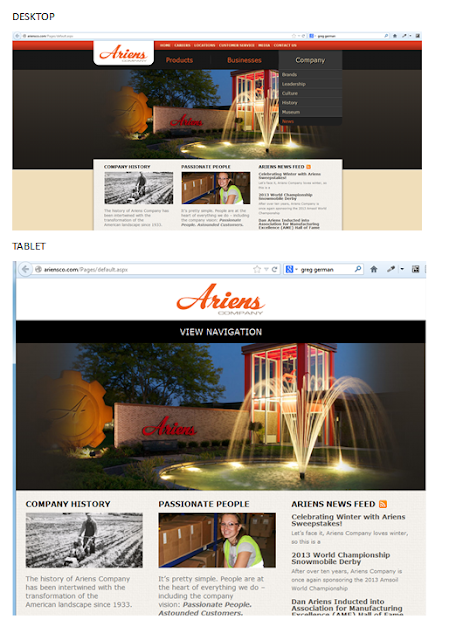
Case SharePoint 2010   Ariensco This is a SharePoint 2010 site that is built to be responsive. For desktop is fine, when you shrink the site to the tablet mode the site is responsive but the navigation disappears and instead you only have "View Navigation." From the user experience point of view, the navigation should be at reach without the user having to click on it, or at least with a JavaScript or custom CSS that when hover up the navigation bar appears.  For tablet it is a good design that it is not optimized with the user experience in mind. For tablet the design would have been optimized if the huge picture have been shrank in order to show off their navigation. When we go to mobile is even worst (you only can fully realize that when looking it from your smartphone). Mobile sites should not be picture heavy; otherwise it makes the site for a tiny screen too crowded, difficult to find our way around and battery drained.  For Ariensco example of mobile ver...
Image
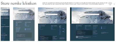
THE REALITY OF RESPONSIVE DESIGN TO THE MOBILE SCREEN (The mobile analysis was done based on the sites presented on  mediaqueri.es .) Here you can see how responsive design are great for some desktop and tablets but might be a bad choice to communicate what your business is and what the user can do in the tine mobile screen. Check for yourself snl.no the big picture with the search in my Nokia Lumia gets the whole screen just for search, to see the rest, what the site is about and what it offers me as a user I have to scroll down. It could be better design for mobile, but this is a good responsive design for desktop and tablets. Another one is Suffandnonsense.co.uk the image when you open is the whole screen, to see what the site is about I have to scroll down. It could be better done for mobile but it is very good for desktop and tablets. You can check for yourself on your mobile all of the sites - this is good exercise to see that pictures might speak m...

Mobile Web Development Strategies also to your mobile

Image
This blog is also available on mobile form, which means that you can read and comment from your phone as well. What would be a blog that speaks about mobile web development that is not available on mobile?

RESPONSIVE DESIGN x MOBILE WEB SITE

RESPONSIVE DESIGN is a way to make the same desktop website change through different CSS stylesheets. The HTML site is nothing more than text wrapped within tags that has no style whatsoever.  When we include some meta tags within the head in the HTML document that limits the range of sizes recognized for tablets and for smartphone applying for both different CSS stylesheet built for specific for tables and for smartphones.  Responsive Design is of the 3 Mobile Web Development strategies that is appropriated for semantic markup that use stylesheets and script to define appearance such as images, layout, etc. It is not appropriated for all websites, products or companies. MOBILE WEB APP or MOBILE-SPECIFC approach is the one which mobile-specific content is built and delivered to mobile devices (both tablets and/or smartphones). This approach is the third of the 3 mobile content approaches and usually involves some kind of server-side detection and redirection. Mobile-specifi...