CREATING CONTENT FOR MULTIPLE FORM FACTORS
One of the critical parts of creating applications for devices is taking
into the form factor (Form Factor means the sizes of the devices among
other electronic things).
This includes the size of the screen or the resolution of the device.
HOW WILL THE APPLICATION LOOK ON PHONES versus TABLETS?
1. There are many applications that are built specifically for phones or specifically for tablets, but there are some inherent web technologies that can be used to target both with mobile web applications.
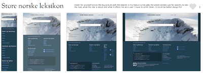
2. One of the most common tactics for creating content that works across devices is with responsive design.
3. Many web developers use responsive design as Responsive design lets you specify different CSS files for different screen size with media queries.
So instead of creating entirely new content or an entirely new application for smartphones or tablets, CAN WE REUSE CONTENT AND SIMPLY SWAP OUR NEW CSS RULES DEPENDING ON THE SIZE OF THE SCREEN?
Yes and it is the easiest way, however it depends on the website, what the company sells? Products? Services? For some products and services and products responsive design may be the answer, but it is not one for all. It does NOT FIT ALL COMPANIESS, all websites, all products and all services.

Comments
Post a Comment