The Power of User-Centered-Design in the fight against Cancer
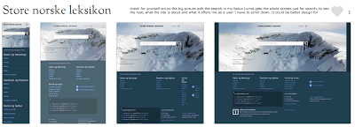
This time I am sharing with a practical example of the power of UX and the user-centered-design when re-inventing from the ground up a website that resulted in increase of knowledge about cancer and its prevention.
It describes in details the goal for the Norwegian cancer society online, its strategy, what were the primarily questions it should answer and how the campaings should be organized.
The results were the impressive make over of the website with + 20% more people contacting the cancer line.
The one time donations increase + 70%, donations total +73% and montly donations + 88%.
That is the power of UX and the user-centered-design, so before think twice if is worthing investing on UX, think if is worthing knowing well your customers and what they need to know and do on your site before you build extremely fancy sites that don't pay off.
Take you time and see Ida Aalen's presentation on the Content Against Cancer.

Comments
Post a Comment