Posts

GREAT FREE WEBSITE EMULATORS FOR TESTING HOW YOUR SITE LOOKS IN THE MOBILE

Image
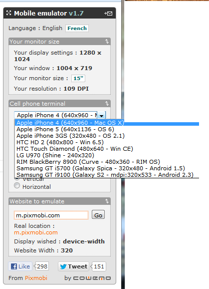
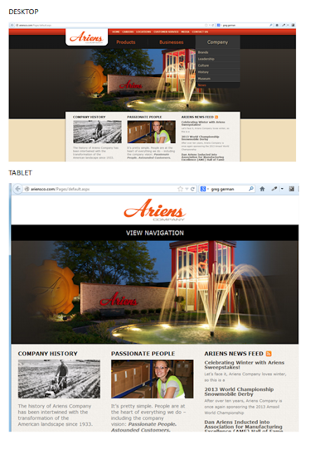
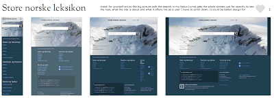
GREAT FREE WEBSITE EMULATORS FOR TESTING HOW YOUR SITE LOOKS IN THE MOBILE The single most important thing you can do to make a website mobile-friendly is to test it on multiple smartphone and tablet platforms. Mobile Emulators lets you check how responsive and if all the functionalities it should have works well across different mobile platforms such as iPhone, iPad, Android and Blacberry without have to make the investment in all those devices. Mobile emulators are not perfect but they can help you to check the issues your website might have allowing you to take the corrective measures. Here are some great websites with emulators: 1. iPad Peek   ( http://ipadpeek.com/ ) - let you check if your website is compatible with iPad. 2. iPhone Tester ( http://iphonetester.com/ ) - A popular choice of web emulator for iPhone. Just enter the URL of your website and in real-time you can see how your site looks like on iPhone. 3. Mobile Phone Emulator ( http://www.mobilephone...

Do you know what is XAMARIN?

Do you know what is XAMARIN? If work with C# and design/build for mobile web and apps this is the tools for you. Much like PhoneGap, XAMARIN is a cross paltform tool for developers who works with C#. They also have a XAMARIN studio (like Aptana and Titanium Studio) and will make your life a lot easier. It also come with a limited free edition that can be used. Check it out...  xamarin.com

Mobile Web Case with SharePoint2010

Image
Case SharePoint 2010   Ariensco This is a SharePoint 2010 site that is built to be responsive. For desktop is fine, when you shrink the site to the tablet mode the site is responsive but the navigation disappears and instead you only have "View Navigation." From the user experience point of view, the navigation should be at reach without the user having to click on it, or at least with a JavaScript or custom CSS that when hover up the navigation bar appears.  For tablet it is a good design that it is not optimized with the user experience in mind. For tablet the design would have been optimized if the huge picture have been shrank in order to show off their navigation. When we go to mobile is even worst (you only can fully realize that when looking it from your smartphone). Mobile sites should not be picture heavy; otherwise it makes the site for a tiny screen too crowded, difficult to find our way around and battery drained.  For Ariensco example of mobile ver...
Image
THE REALITY OF RESPONSIVE DESIGN TO THE MOBILE SCREEN (The mobile analysis was done based on the sites presented on  mediaqueri.es .) Here you can see how responsive design are great for some desktop and tablets but might be a bad choice to communicate what your business is and what the user can do in the tine mobile screen. Check for yourself snl.no the big picture with the search in my Nokia Lumia gets the whole screen just for search, to see the rest, what the site is about and what it offers me as a user I have to scroll down. It could be better design for mobile, but this is a good responsive design for desktop and tablets. Another one is Suffandnonsense.co.uk the image when you open is the whole screen, to see what the site is about I have to scroll down. It could be better done for mobile but it is very good for desktop and tablets. You can check for yourself on your mobile all of the sites - this is good exercise to see that pictures might speak m...

Top 10 Reasons to Use HTML5 Right Now | Codrops

Top 10 Reasons to Use HTML5 Right Now | Codrops : 'via Blog this'

RETHINKING THE MOBILE WEB presentation by Bryan Rieger

This is a Slideshow RETHINKING THE MOBILE WEB by by Yiibu Author: Bryan Rieger (September 10, 2010)

WHY AREN’T MOBILE WEB DEVELOPERS DOING THEIR JOB?

I came across a very interesting website quirksmode.org in the Mobile section that explain beatifully in many parts what I believe that is the problem with mobile web design nowadays. I will be copying what I think is the most important points here. Some I might discuss but you will understand the probem when you read it. MOBILE WEB DEVELOPERS DOING THEIR JOB? The unique selling point of the web is that it runs on all devices; and not just on one platform. But it seems mobile web developers aren’t much interested in reaching out beyond one or two specific platforms. Developers should reach out to as many paltforms as humanly possible instead of confining themselves to the best ones. WHY ARE WEB DEVELOPERS INTERESTED IN MOBILE SO RELUCTANT TO VENTURE OUT BEYOUND THEIR iPHONE CONFORT ZONE? Mobile web projects for large companies are based on requirements written last year, during the height of the iPhone obsession. In addition, the iPhone’s share of mobile web traffic remains...