Posts

What UX is and why your company cannot live without it?

Most of IT companies don’t see UX (User Experience) should be at the heart of everything they do which leads to their inability to present and sell UX as the starting point of any project. UX in most case is sold as an “extra” service while they should be seen as the starting point of any IT business strategy. UX is everything - it starts with the customers, go deeper to their customers and it should end with them in mind! What UX really is? UX is a business and digital field in itself. The misconception here is that most people think of UX as just usability. Usability though is simply how easy to use and simple the website functionalities are to the end user. For usability we have plenty of best practices already in place and even standardized. Bear  in mind that usability is only part of UX! UX is a continuous work that starts by what customers want to accomplish with their site, and not how they want the site to be , unless they are the ultimate end user of the site...
The Myth of HTML5 and How It's Misunderstood

HTML5 MISCONCEPTION Nowadays any new browser capability or web application technique found across the web is labeled as HTML5 and that is not true. Michael Mahemoff said that HTML5 has become a brand that represents a new type of web application rather than the specification itself. In order to learn HTML5 is very important to understand what really HTML5 is. It is common nowadays hear CSS transitions, web sockets, geolocation, SVG, CSS @font-face all mentioned under the HTML5 banner and label all under HTML5 "brand".  In the specification none of those mentioned are found for the simple reason that they either belong to the CSS3 specification or other API specification within the WWW Consortium. Websites are and will be built with a combination of HTML5, next-generation APIs, JavaScript and CSS3, which means that as a designer or developer the difference between those technologies must be clear and how they fit together should be understood. What is really HTML5? ...

Lessons To Be Learned From Facebook Mobile User Growth To 54% From Last Year

Lessons To Be Learned From Facebook Mobile User Growth To 54% From Last Year Today one of the headlines in the -> Online Media Daily was that advertisement on Facebook social network's mobile business rose to 30% of its sales this year compared to almost nothing last year which was responsible for the 39% overall raise of Facebook revenues . The lesson to be learned here is clear MOBILE USE is rising significantly and Facebook knows that because their monthly active mobile users is 751 million in the end of March. What that means? It means that Facebook mobile monthly active users have grew 54% from last year. Let's compare a bit The numbers above show how mobile users has double this year compared to the last one, but the same Facebook has announced that their monthly active users grew 23% compared to last year. This is  a real bomb news for the Mobile World It means that mobile is growing so fast that any company that try to blind itself...

How can we learn from technology job trends to find out how the IT market is consuming those technologies

Image
I found this week a web site that has very interesting information about technology trend jobs. This information is vital in order to have a very good idea about how the IT market is consuming those technologies. I really worth to see those charts below and reflect on it. The information cames from Indeed and Simply Hired they have much more if you want to look at, but I have chosen to embbed in in the blog what has to do with HTML5, jQuery, Mobile Apps, iOS, and Android. Indeed and Simply Hired searches millions of jobs from thousands of job sites. This job trends graph shows the percentage of jobs people find that contain the search terms. 1. Mobile App Trends Mobile-app jobs 2. HTML5 Job Trends HTML5 Job Trends 3. jQuery Job Trends jQuery Job Trends 4. iOS Job Trends iOS Job Trends 5. Android Job Trends Iphone, Ipad, Ios, Android, Wp7, "Windows Phone", Blackberry, Webos, Cordova, Ph...

REAL USABILITY MATTERS

REAL USABILITY MATTERS - Usability is one of the single most important thing you can do to ensure success and money. Any design should have the user in mind, however when we talk about small screens this is a must. The Google presentations  What is a mobile site and why do you need one?  try to give business people and even developers the awareness that mobile sites nowadays is a must - but if they are build without the user in mind there is not use to have it. Their case studies are interesting. Mobile-friendly web apps help businesses: To connect with their customers Increase Revenues Reduce Costs because when sites are optimised and user-friendly you give your customers means to get what they want instead of wonder around, get tired and go to your competitor. The catch is that the only way to accomplish that is to invest in Usability. IT IS ALL ABOUT USABILITY. Improved usability makes you INCREASE YOUR MARKET SHARE - the like effect...

Mobile Friendly Contact Forms

Mobile Friendly Contact Forms The way to go for mobile friendly contact forms is the touch-friendly CSS styling in order to make the buttons, controls and inputs with touchscreen experience. 1. Large touch target areas will definitely improve the form input fields 2. Other forms of input can also greatly benefit from input controls with CSS styling 3. HTML5 input types should be use to trigger keyboard events to aid the user on having  a great experience. Depending on the input type selected mobile browsers have different on-screen keyboards for different froms of data that should be taken into account. Just by including in the label the type="" and inside the quotes tel for phone numbers, url for websites, time for time, date for the date, e-mail for email we can make the keyboard behave accordingly with is very useful. I constantly came across mobile websites that make me look for the @ when I have to enter my e-mail, or any other type of data that is n...

GREAT FREE WEBSITE EMULATORS FOR TESTING HOW YOUR SITE LOOKS IN THE MOBILE

Image
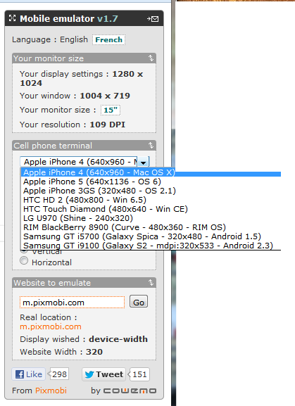
GREAT FREE WEBSITE EMULATORS FOR TESTING HOW YOUR SITE LOOKS IN THE MOBILE The single most important thing you can do to make a website mobile-friendly is to test it on multiple smartphone and tablet platforms. Mobile Emulators lets you check how responsive and if all the functionalities it should have works well across different mobile platforms such as iPhone, iPad, Android and Blacberry without have to make the investment in all those devices. Mobile emulators are not perfect but they can help you to check the issues your website might have allowing you to take the corrective measures. Here are some great websites with emulators: 1. iPad Peek   ( http://ipadpeek.com/ ) - let you check if your website is compatible with iPad. 2. iPhone Tester ( http://iphonetester.com/ ) - A popular choice of web emulator for iPhone. Just enter the URL of your website and in real-time you can see how your site looks like on iPhone. 3. Mobile Phone Emulator ( http://www.mobilephone...